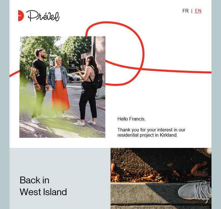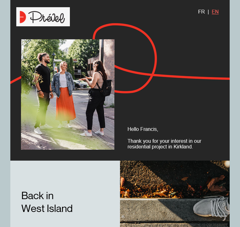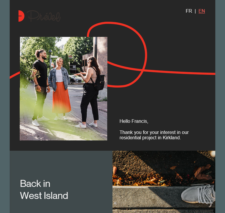
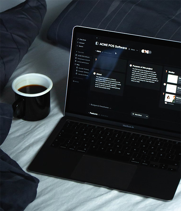
Dark mode: the new key to newsletter design
iPhone and iPad
Mac
Android
Windows (Outlook)
Browsers
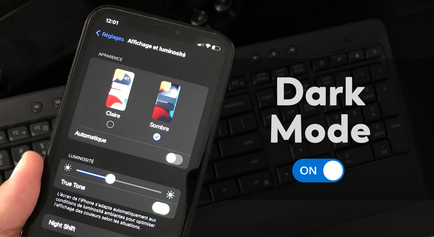
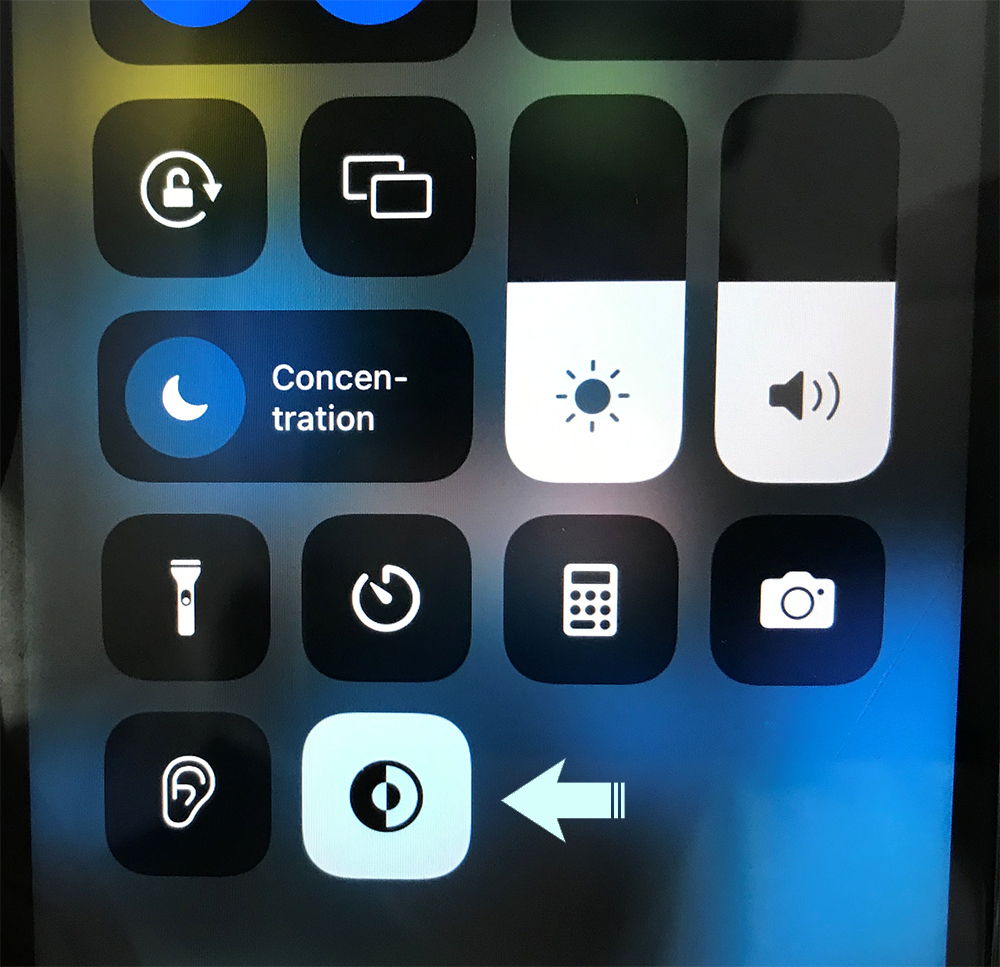
iPhone and iPad
| Change the display settings on your devices using the following steps: | ||
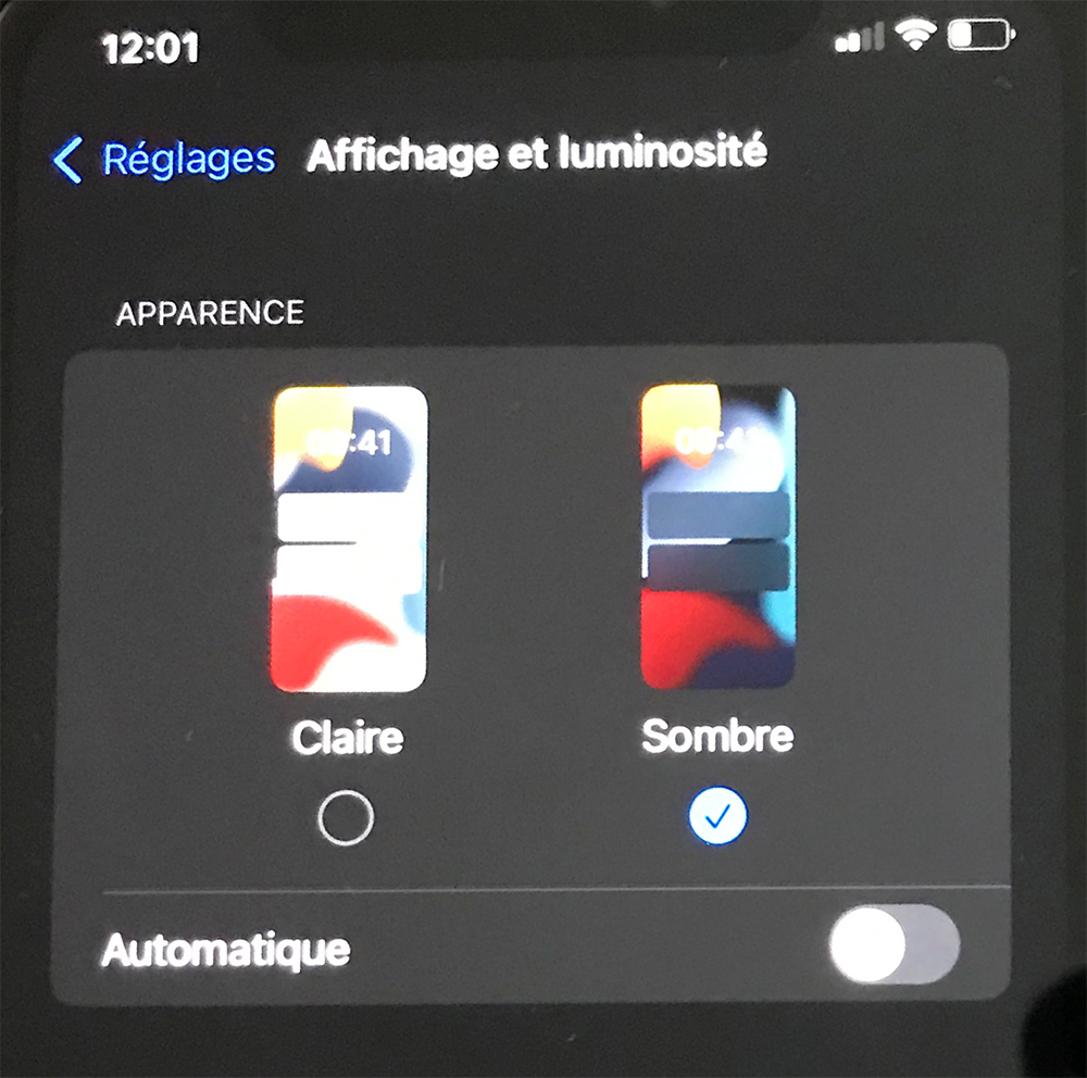 |
In newer iOS versions, simply swipe down from the top right corner of your device to access the control center, then select “dark mode”.
 |
|
| * Operating system: iOS13 and up. | ||
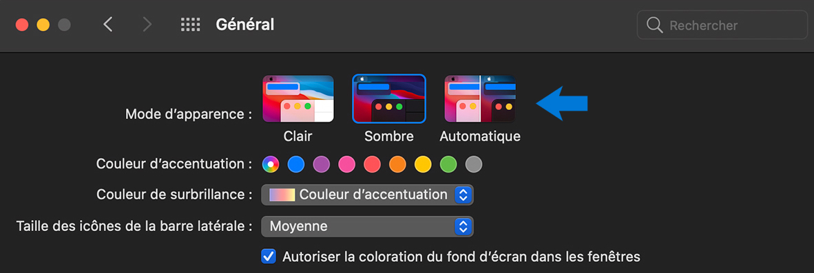
Mac
Enable your Mac’s “dark mode” using the “Apple” menu like this:
* Operating system: iOS13 and up.
- Click on the “Apple” menu in the upper left corner of your screen.
- Select “System Preferences”.
- Click on the “General” icon.
- Turn on “Dark Mode”.
* Operating system: iOS13 and up.
Android
Display dark colors on your device by following these steps:
- Swipe your screen from the top left corner of your device.
- Access your settings by clicking on the gear icon.
- Scroll down to the “Display” section.
- Turn on “Dark Mode”.
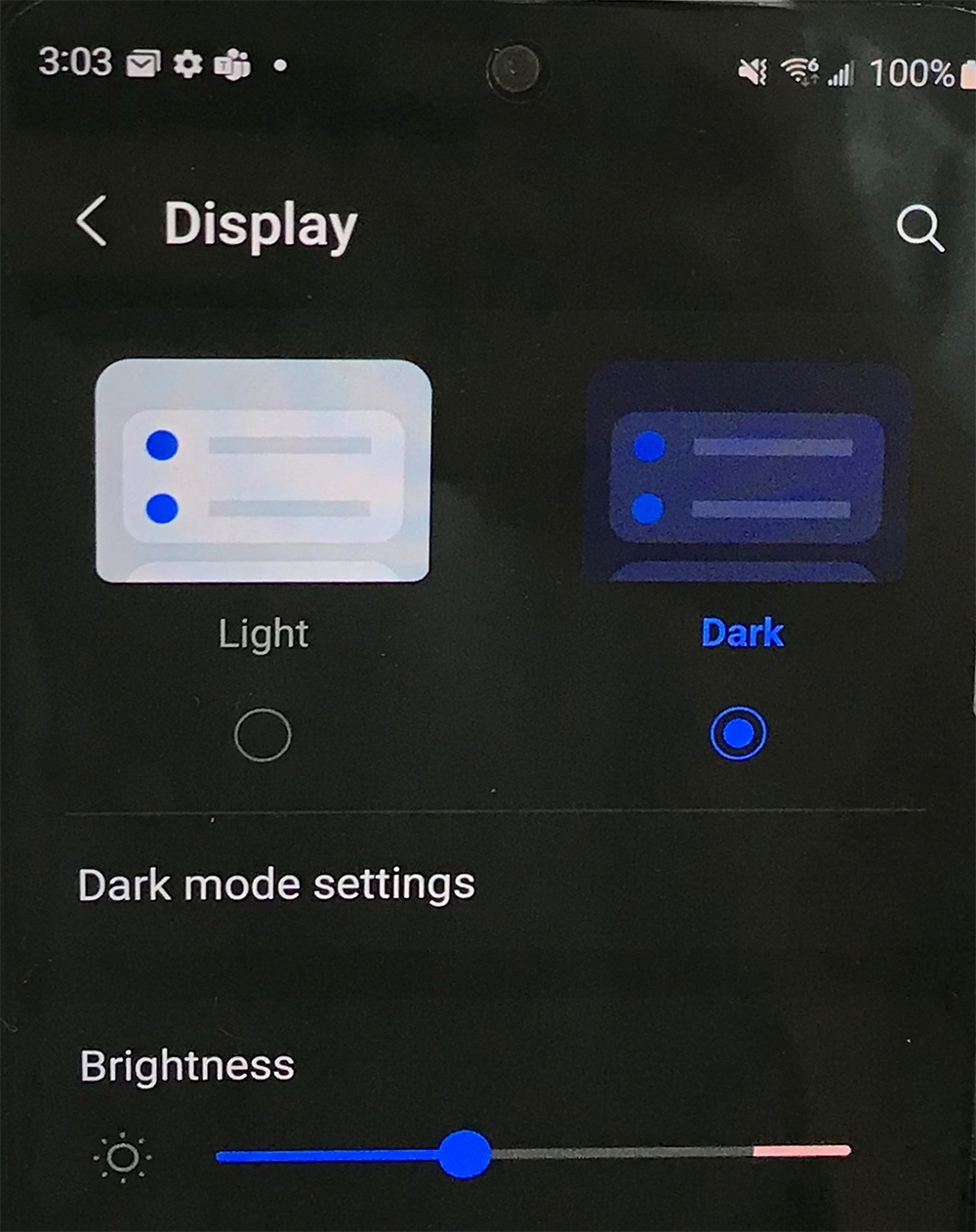
*Operating system: Android10 and up.
Windows (Outlook)
Switch to “dark mode” in Outlook using the “Windows” menu:
- Click on the “Windows” menu in the lower left corner of your screen.
- Select the “Settings” icon located above the power icon.
- Click on “Colors” in the side menu.
- Turn on “Dark Mode”.
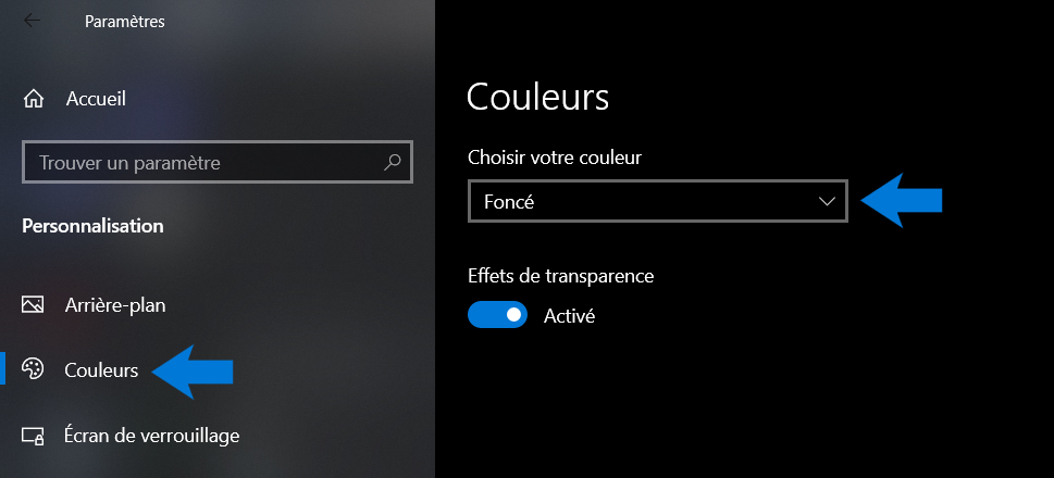
* Operating system: Windows10 and up.
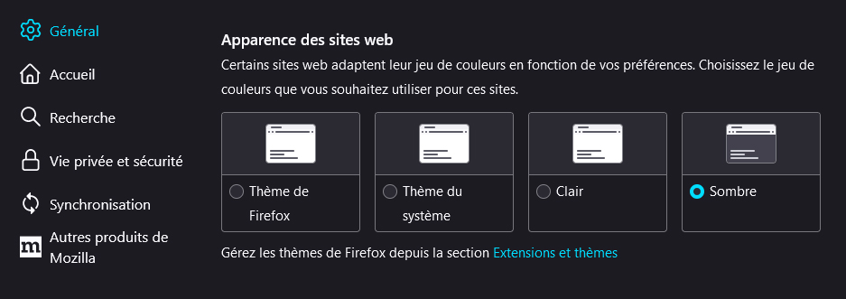
Browsers
How to enable “dark mode” differs depending on the browser used:
Firefox ![]()
- Click on the hamburger button in the upper right corner of the browser.
- Scroll to the “Settings” option in the submenu.
- Turn on “Dark Mode”.
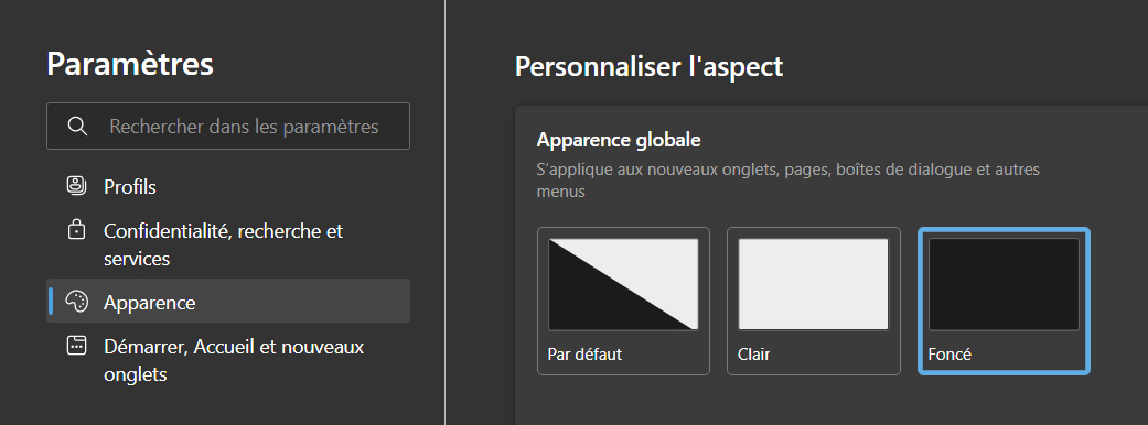
Edge ![]()
- Click on the ellipsis in the upper right corner of the browser.
- Scroll to the “Settings” option in the submenu.
- Select the “Appearance” category from the side menu.
- Turn on “Dark Mode”.
Chrome ![]()
“Dark Mode” is available on the Chrome browser from an extension.
- Click on the ellipsis in the upper right corner of the browser.
- Scroll to the “Settings” option in the submenu.
- Select the “Appearance” category from the side menu.
- Click on “Theme”.
- Search for “Dark mode” in the search bar.
- Select the “Dark mode” extension as shown below.
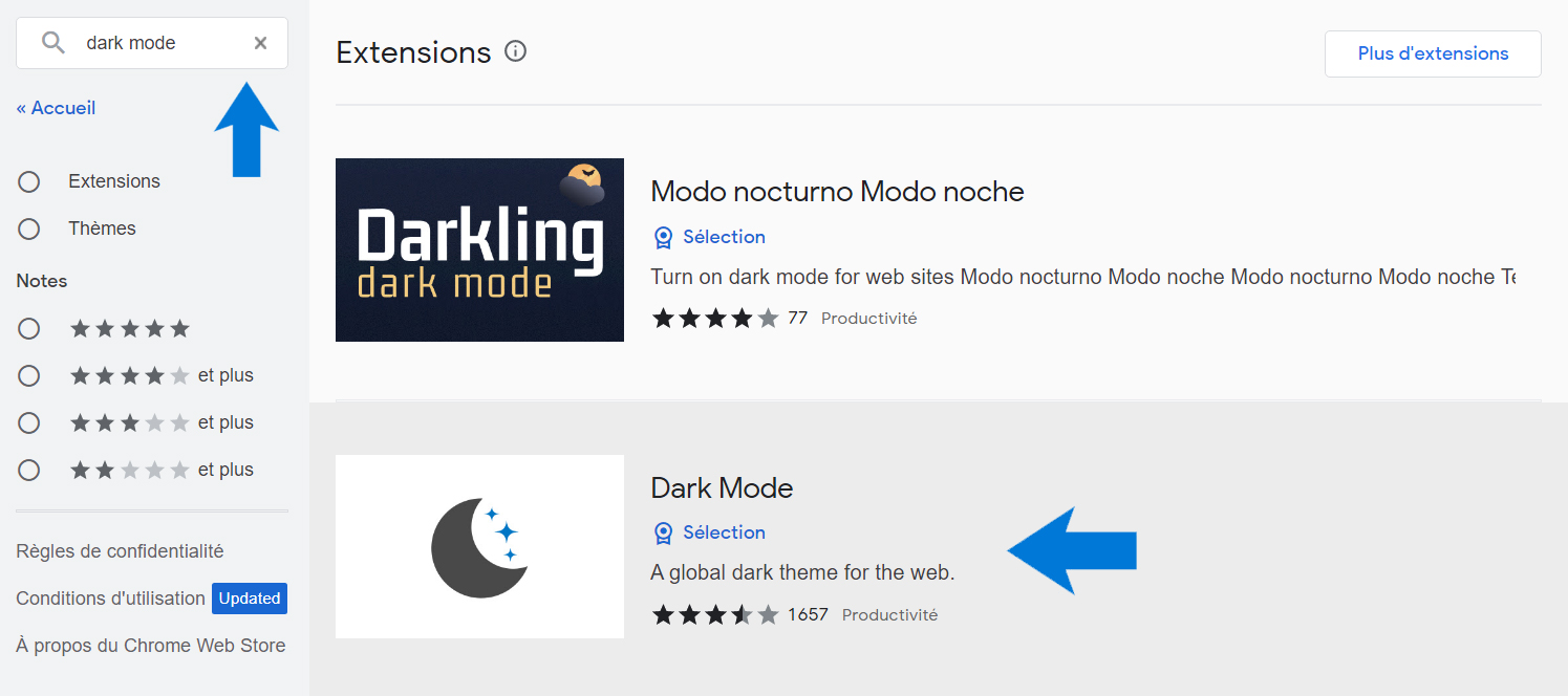
- Click on “Add to Chrome” and confirm.
- Click on the “Puzzle Piece” on the right in the browser menu and activate the extension.