

Email mobility, think about optimization!
Posted on by Francis Sauvé, directeur marketing
BOOST YOUR RESULTS WITH EMAILS THAT ARE ADAPTED TO MOBILE SCREEN DEVICE
Iphone or Android? Tablet or mobile app?
Considering that more than half of emails are read on a mobile device, it’s imperative to think about this aspect when building your newsletters. The visual is as important as the content. You have a message to deliver to your costumers, and the “look” of the email will strongly impact whether they take the time to read it or not. In short, you want to immerse your readers in a visual environment that matches your business and your brand. It’s therefore essential to ensure that the final newsletter product is optimal on mobile devices.
Fortunately, our specialists can take care of it!
Email marketing is growing because of phones and tablets !
You are in line? At the doctor’s office or waiting for a meal? Drop your phone and look around! Are you the only one that is not looking at a screen, regardless of age? Possibly, since mobile phones have become an escape from the boring moments of our lifes!
Our phone is now mobile and this mobility has become our favorite way to communicate, whether it’s with SMS or social networks. Email communication is no exception and you must be aware of this phenomena to ensure your emails campaigns reaches it’s full potential.
In fact, it’s recently been shown that 81% of email subscribers between ages 18 and 34 (a study conducted by Adobe in 2017) use their phone on a regular basis to check their emails. At ADNETIS, we see that for most of our senders, more than half of emails are now open on mobile devices. This is a huge uptrend compared to only a few years ago.
You spent hours creating graphics that fit your company’s visual identity? You performed tests on your computer? You may think you’re done, but it’s a huge mistake! You must do the same efforts on a mobile phone to ensure that your newsletters have the same impact on mobile inboxes than for desktop readers.
Briefly, if phones have the mission to facilitate our lives, they also complicate the lives of email marketing experts. However, once you will have understand how to make good use of mobile technology, it will provides new potential for your marketing goals.
You don’t master the tools to make your emails phone friendly, or just don’t have the time to do it? Mandate our specialists in mobile optimization so you don’t neglect more than 50% of your subscribers, who will see your newsletters on a mobile device!
Your newsletters are automatically mobile, but not optimized!
All newsletters designed with ADNETIS’s email marketing software are automatically mobile. Thus, all sections are superimposed and calibrated on mobile devices.
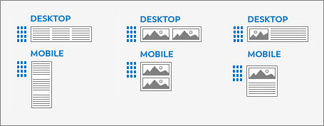
It’s therefore very important to take this aspect into consideration when designing your graphic template. For example, if you put an image to the right of a paragraph while editing your email, this image will appear UNDER the text in mobile. Depending on your needs, you may want to reconsider how your elements appear on mobile so that the image comes before the text.
In short, the creation of mobile newsletters is done by default at ADNETIS, but the result is far from optimal. To obtain a great email, it’s necessary to align the visual and textual elements for mobile and especially … to preview this version of the email before making your final expedition!
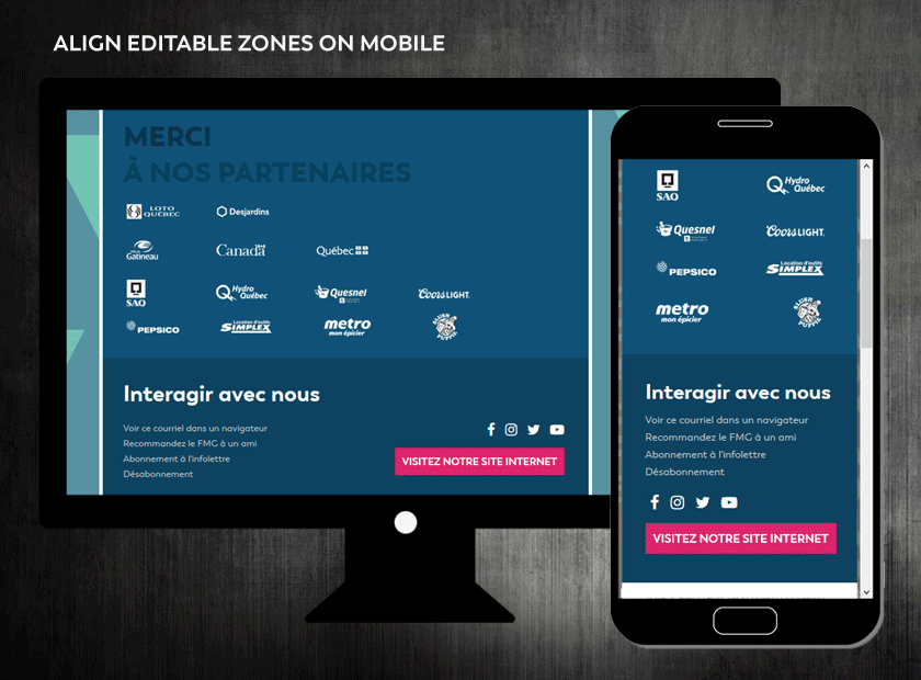
See what your newsletter will look like on a mobile device
When creating your newsletters, use the “Preview” button to see your newsletters as they should be received by your subscribers who will use a computer to consult them. This is found in the “LEFT” portion of your screen in the newsletter editor.
Now that your “Web” version’s complete, watch the rendering of your creation on mobile! The “Preview” tool also allows you to get an overview of the mobile result of your newsletters. To do this, simply select “Mobile” in the LEFT TOP CORNER of your screen.
This handy tool will give you a foretaste of the position of visual and textual elements on the mobile phones of your subscribers.
However, take into consideration that some details may differ from the mobile preview if you perform a test on your phone. In fact, your device could interpret your newsletter in different ways depending on your manipulations. That’s why we invite you to use our multiplatform optimization services. If you do so, our team of experts will use several optimization techniques so that your newsletter is as aesthetic as functional on the platforms used by your clients.
How to optimize the mobile version?
The ADNETIS newsletter editing system allows you to adapt your newsletters to mobile up to a certain level of optimization. Several features are available for you to get a professional result. These don’t require any special knowledge of HTML coding, but they do require some willingness if you want to impress your audience. When you receive a newsletter that’s visually impressive, understand it’s not a coincidence. Several methods used by email marketing specialists are behind this result!
In brief, all the tools you need are right there under your eyes. So all you have to do now is to take the time to use them and to visualize your mobile result, or to use our advanced mobile optimization services!
Here are the main mobile optimization tools available to you:
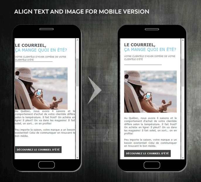
Elements alignment :
If you put your cursor over an editing box, you’ll notice the appearance of a menu specific to the area selected. Among the various options this menu offers, the alignment of the elements is available to modify.
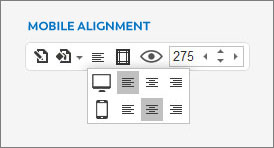
Use this feature to optimize the alignment of the visual and textual elements of your mobile newsletters! A text on the LEFT on a computer and on the RIGHT on a mobile device, anything is possible.
Mobile alignment example :
It’s all about taking the time to make the email on both devices look perfect by letting your creativity work!
Margin between elements :
Still while moving your cursor over an editing box, you can adjust the margins of items specifically to the display of your mobile newsletters.
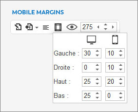
Margin optimization on mobile will take your campaign to the next level. Try them once, and you won’t be able to live without them! Margins are the essence of a successful mobile optimization.
Example of margins optimized for mobile :
In short, the margins allow you to remove the text from the ends or to delimit the vertical spacing between elements.
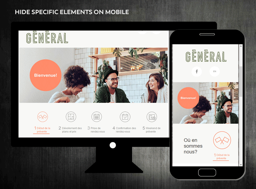
Hiding a complete editing section :
You’ll notice an “eye” next to the margins in the menu of your editing spaces. Activate it to hide the display of a complete area on a mobile phone.
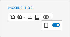
Some visual or textual elements are not necessarily desirable in a mobile newsletter. This “camouflage” feature allows you to remove the display of a complete section for an optimal mobile experience.
Example of a completely hidden editing area on mobile :
Keep in mind that it’s also possible to hide an image on computers, but that requires an intervention from one of our specialists in advanced optimization.
Advanced mobile optimization
You have more and more requirements in terms of personalized graphics that adapt to the mobile devices of your subscribers and we are here to meet your growing needs!
Here at ADNETIS, we grant high importance to mobile emails and we specialize in the optimization of newsletters for more than 50% of your emailing list’s members who’ll read them on their mobile devices.

In order to perfect your marketing campaign, you’d need to use a wide variety of mobile optimization techniques that require knowledge of different email inboxes and mobile devices. Unfortunately, we can’t add all these features to the platform and make them available to you. Why not? It’s simply because these are advanced coding methods requiring the deployment of advanced settings specific to each newsletter.
Here are some examples of the expertise of our mobile optimization specialists:
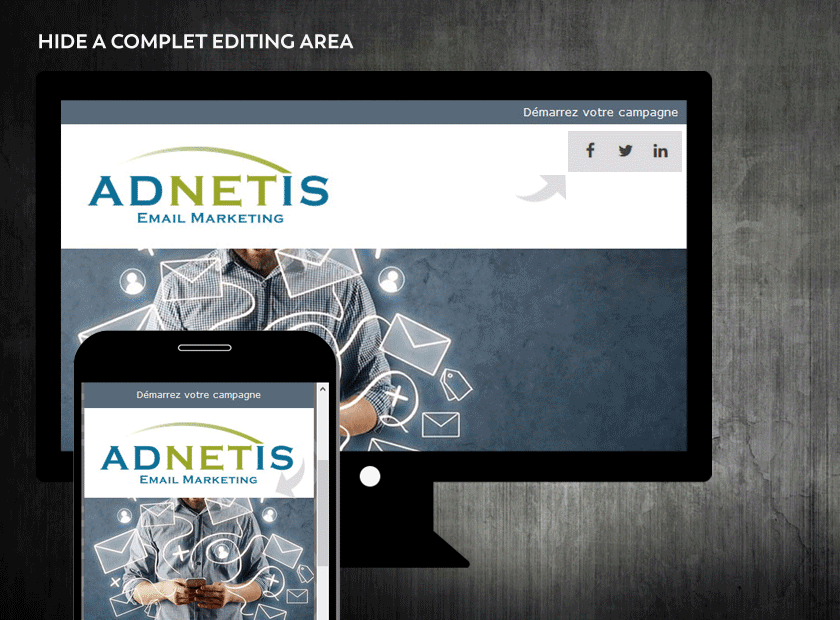
Advanced textual optimization :
We utilize mobile-specific text optimization techniques to increase or decrease typography on a mobile device. Thus, you can count on our knowledge if you want to display your slogan in big, eye catching letters when your newsletters are viewed on a computer and reduce that same catchphrase when appearing on mobile.
Example of decreased typography on mobile:
Briefly, our text optimization techniques for mobile allow you to optimize the impact your text can have in computer inboxes while maintaining high-quality mobile readability.
Advanced camouflage of specific elements :
Does the newsletter you need require hiding a specific visual or text element? The magic eye makes the whole editing zone disappear, but only one element inside of it must go on mobile? You’ll have to use advanced camouflage techniques to show or hide this item to your mobile users.
Example of the camoufflage of a specific element on mobile :
Our specialists will take over to orchestrate the execution of this advanced multimedia integration feat!
Advanced image optimization:
A good mobile optimization surely implies a great display of the images contained in your newsletter!
You created a banner containing text? It’ll be visible on a computer, but the text will be tiny when viewed on a mobile device. The image will be compressed to the resolution of the mobile screen and your marketing impact will be reduced to zero!
Our experts will use integration techniques to completely replace images from your web and mobile versions. For example, it’s possible to display oranges on a computer and bananas on a mobile device!
Example of the replacement of an image on mobile :
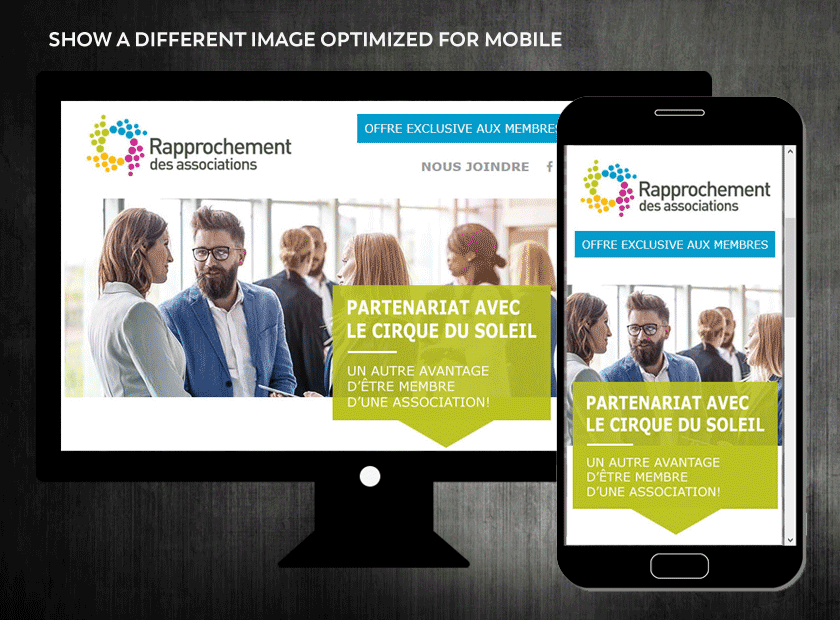
The results you’ll get with optimized images are the most impressive! Experience it … Our modern optimization techniques have everything you need to help you stand out from your competition!
LET'S WORK TOGETHER !
ADNETIS offers you three (3) potential working methods to optimize your newsletters for your subscribers using a mobile device. Each of them is personalized to your needs, according to your situation and your technical knowledge in multimedia integration.
Méthod « Do it yourself »
You’re already using our solution in “self-service” mode and design your newsletters by prioritizing the “desktop” aspect? Ask us our opinion on the “Mobile” version of your creation before the final expedition of your newsletter. We’ll quickly study the mobile rendering of your newsletter. If applicable, our specialists will raise the red flag before it’s too late!
Méthod « Do it with us »
Does the mobile optimization of your newsletters seem complex? Or you simply don’t have the time to take care of this part? Entrust us with your mobile optimization once you’ve completed the version for subscribers using a computer!
Méthod « We do it for you »
We’ll take in charge your entire email marketing campaign from ideation to graphic design to multimedia integration, all that while making sure the mobile aspect of your email is game ready!

Francis Sauvé
Marketing director
Want professional advice?
Email-based communications strategies are no secret to this email software specialist. When ever you have questions about emailing strategies or how to get to a certain design goal, he his there to handle the situation.
Get more details on how to optimise your emails for mobile devices by contacting him right now! He will be able to offer you innovative and creative solutions for your email marketing campaign.
E : fsauve@adnetis.com
P : 1-877-638-6584